

Sunday, September 20, 2009
Friday, September 18, 2009

Thursday, September 17, 2009

Wednesday, September 16, 2009
Illustration «Shit happens»
At the same time illustrates the longing for life and well-known slogan — shit happens.
Friday, September 11, 2009
Poster for «EGE-center»
There is such a wonderful company «EGE-center». These guys are engaged in noble cause —they increase the level of education in the capital. When a student or his parents cling to the head, «EGE-center» comes to the rescue and pulls student performance to the level required for successful delivery of the unified state examination. They do this through a highly qualified teaching staff.
Not so long ago, «EGE-center» recognized the need for a normal site and appealed for help to Someteam. Just «EGE-center» feel the need for brochures and posters, Someteam and this has helped them.
We had to make a bright, modern and eye-catching poster which would be collected adolescents as a magnet metal shavings.
Thursday, September 10, 2009

Tuesday, September 8, 2009

Sunday, September 6, 2009
Coming soon
It may seem that there is a real calm, but work on «Somesite» really are. It will be cool.

And in the development of 4 other project, a variety of colors and weight categories. More about them later, on each separately.
And in the development of 4 other project, a variety of colors and weight categories. More about them later, on each separately.
Friday, September 4, 2009
Design and corporate identity for «Republic travel»
While people luxuriate in the hot sun beatches and otherwise relax in warm countries, someone else is working, creating a holiday first necessary conditions. This fate is not spared and Someteam. For the young, but a hell of an ambitious and promising tourist company «Republic travel» was created website. The resource was created with a focus on three major offers — things to do in Brazil, Malaysia and the Philippines. Working on the site, we assumed that the purpose of this resource lies in the fact that a visitor would want to visit these places, could easily understand the proposals and the tour operator to quickly make an order, not be concerned by filling pile useless fields.

Before starting work, the author, to his utter shame, did not even know the correct spelling of the word «Malaysia» as well as copywriting in this project too hung on us, work was to a considerable.


Особая гордость — наша находка для формы быстрого заказа. Она сделана в виде клевого ретро-чемодана, как бы намекая клиенту собирать вещички:Special pride — we find forms for quick order. It was made in a cool retro suitcases, as if alluding to the client to pack up:

And then there are pages of contact information and hot orders. They are made with the same love as everyone else.


Just for «Republic travel» was established corporate identity. Two variants of the logo — color and b/w.

Business cards, envelopes, letterhead.


And the chocolate gold coin as a company logo, that would have been sweeter rest.

Before starting work, the author, to his utter shame, did not even know the correct spelling of the word «Malaysia» as well as copywriting in this project too hung on us, work was to a considerable.
Особая гордость — наша находка для формы быстрого заказа. Она сделана в виде клевого ретро-чемодана, как бы намекая клиенту собирать вещички:Special pride — we find forms for quick order. It was made in a cool retro suitcases, as if alluding to the client to pack up:
And then there are pages of contact information and hot orders. They are made with the same love as everyone else.
Just for «Republic travel» was established corporate identity. Two variants of the logo — color and b/w.
Business cards, envelopes, letterhead.
And the chocolate gold coin as a company logo, that would have been sweeter rest.
Wednesday, September 2, 2009
Andrey Prahov's website
Artist Andrew Prahov draws in impression style. Admire his creations can be here. He even has his own website and now there is a terrible horror. Apparently, someone realized him about it, or he guessed, but one way or another, appeared in the artist's desire to replace the site. Someteam was glad to help him in this.


It was invented by the original concept, based on the fact that the main purpose small website for an artist is to present his creations. Therefore absolutely from any page of the resource can view its gallery. Latter is presented on a virtual easel, it is possible to dissipate the picture itself or run a slideshow.
Visual style is made match for the style of the artist's paintings — brightly and boldly. Menu items are made in the form of fingerprints from cans of paint. For the sake of naturalness, it was decided to draw all these old-fashioned paper, paints, and then jump on it with the camera. Therefore even a firm «sperm» studio — drawing. The website has received clean, light, free and stretches.
Tuesday, September 1, 2009
Someclock hours concept
Someteam is pleased to present its vision of modern her watch — a Someclock hours concept.
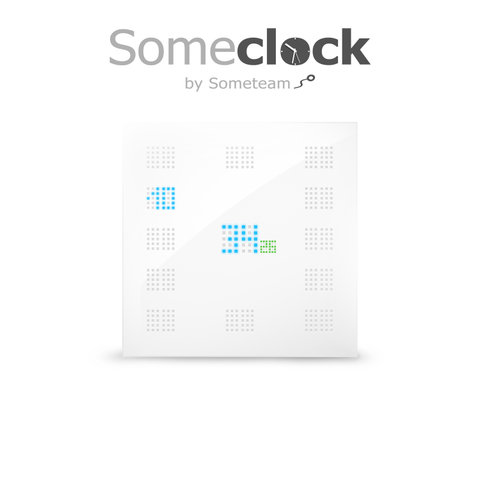
Someclock show time numbers as electronic watches, but there are both mechanical, perfectly visible in any light and its absence. In the middle of a blue minute and greens a second, watch themselves are where they should be, as a classic dial. Holder of such clocks will always be able to quickly and accurately determine the time, not being distracted by the details. For those who do not see in the dark, illuminated buttons. In addition, these buttons are easily accessible and tactile make out. Sharpened on the right-handed, like everything else in this world. Remarkable look at contemporary interiors. Especially recommended for use in offices, as harmoniously emphasize their austere style:

Well, a little more information and presentation slides:
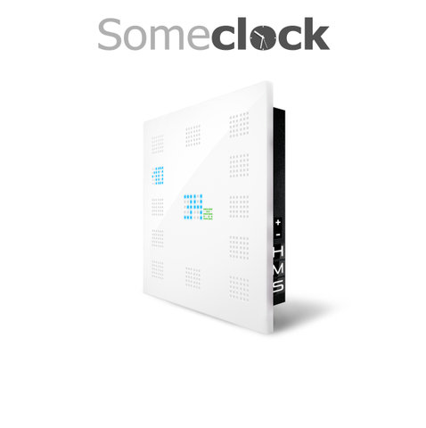


Among the shortcomings can be identified the need for careful care with a soft cloth from iPhone. This glamorous gloss horror as likes to collect dust and all the dirty things.
And, as always, any use anywhere and in any way only with our own blessings. Copyright, there, right, and all that.

Subscribe to:
Posts (Atom)